
The Creative Brief for a Charger Screen: What Works When the Audience Is Standing Still
Meta description: Most charger-screen ads are repurposed social cuts, and they underperform. Here’s how to brief creative for a standing, captive audience — frame by frame.
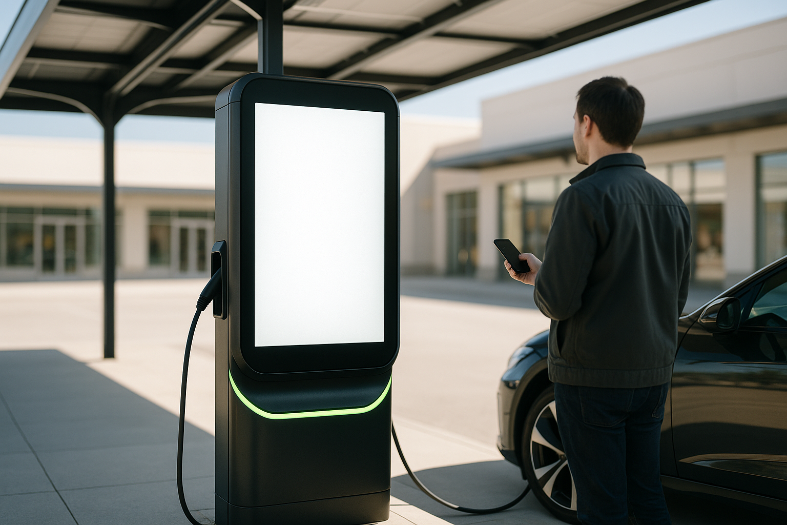
The best-performing ad on an EV charging network usually arrives as a repurposed social cut, and it shows. Vertical video, fast cuts, a caption-heavy hook in the first second — all of it built for a thumb that is already moving. On a large digital display above a charging column, that same spot reads as noise to someone standing only a few feet away with nothing else to look at for twenty minutes.
That mismatch isn’t a media problem. It’s a brief problem. And it costs advertisers the one advantage the channel actually sells: an audience with nowhere else to be.
The feed and the charger ask different questions
Feed video earns attention by interrupting. It competes against a finger, so it front-loads a hook, burns through cuts, and repeats the offer three times before the skip button appears.
At a charger, none of those mechanics apply. The screen is physically large, lit, and roughly at eye level for a driver standing beside their car. The viewer isn’t deciding whether to keep watching. They’re deciding what to think about while the vehicle fills.
That changes the job of second one. In a feed, second one stops a scroll. On a charger screen, second one has to be legible from across a parking row. Different problem, different craft — and the second one is easier to solve, because you’re not fighting for the click, you’re earning the thought.
How a 15-second charger spot is actually structured
- Seconds 0–3 — one identifiable object. A product, a logo, a face-free tableau. It must resolve instantly from ten feet away, in daylight, with sunglasses on.
- Seconds 3–8 — one sentence of value. Not three benefits stacked. One. Read it out loud; if you run out of breath, it’s too long for the format.
- Seconds 8–12 — the reason to act now. A location, a date, a code, a season. Charger audiences are in a parking lot — proximity is an advantage, so use it.
- Seconds 12–15 — the brand, held. Give the logo a clean beat at the end. Do not cut away from it at the last frame.
Repeat that cycle with variety rather than building one escalating narrative. On a 24/7 rotation, a driver who charges twice a week sees you many times. A single escalating story gets tedious by visit three; a family of spots one idea apart stays fresh.
Typography rules that only apply outdoors
Text on a charger display is read at distance, in motion, sometimes in glare. Three rules cover most of it.
One typeface, two weights. A display face for the headline, a plain grotesque for the supporting line. No script, no condensed novelty fonts.
High contrast in both lights. Test the layout at noon and at night. A deep navy on black looks refined in a designer’s mockup and disappears in a parking lot.
No more than six words on screen at once. If the line needs a comma and a clause, it’s a voiceover line, not a card.
“The charger is not a smaller version of the feed. It is a bigger, stranger, more patient format. Brief it like a poster, deliver it like a broadcast.”
— Media planning note, EV Across America
The brief template we hand to creative teams
A one-page creative brief covers the whole job. Fill in these fields and the spot almost writes itself.
- Placement: Which charging station environments — grocery, theater, retail plaza, commuter lot.
- Viewer state: Standing, waiting, phone in hand, car charging, moving on in twenty minutes.
- Single message: The one sentence you want repeated on visit three.
- Visual anchor: The object or color that identifies the brand in under three seconds.
- Distance test: Can the layout be read from the far side of a parking row?
- Sound assumption: Assume sound is off. Every message must survive silent.
- Rotation set: How many distinct executions, and what single variable changes between them.
- Call to action: The physical or time-based next step available within a mile.
Five spread concepts that work on a captive audience
Charger audiences reward adjacency, season, and neighborhood specificity. These five formats carry their weight across the network.
- Neighborhood substitution. A grocery brand runs a different offer at each store’s chargers, tied to that store’s weekly circular. The screen is on the lot; the store is behind it.
- The two-visit story. One spot teases, the next pays off. With repeat charging patterns, a two-part sequence reads as a campaign rather than a loop.
- Weather and season triggers. A tire or energy brand swaps creative on a temperature or storm trigger. Relevance beats polish on a screen someone stands in front of.
- Venue coordination. A studio or streaming advertiser aligns a charger flight with a theater’s opening weekend in the same plaza. The driver is already parked for the trip.
- Genuine proof. A testimonial-style spot with a real, permissioned customer, shot plainly. On a large quiet screen, an unpolished real voice outperforms a produced one.
Each of these depends on the same thing: the audience is stationary, local, and already on a retail property. The creative should behave like it knows that.
Common creative mistakes on charging screens
Watch what runs on any network for a week and the same errors show up.
- Dumping the whole product line into one frame. Legible means decidable, not comprehensive.
- Captions burned into a video asset. They were sized for a phone, not a large display. Render them separately.
- A 30-second cut with the pitch at second 24. The attentive viewer is there for the whole thing, but the passing viewer isn’t. Front-load anyway.
- Density over contrast. White space isn’t wasted inches; it’s what makes the six words land.
- No versioning by venue. A theater lot and a commuter lot are different moments. One spot for both wastes both.
One line to give your creative team today
Write it for a person standing in a parking lot, waiting on their car, who will see it eleven more times this month. That person notices craft, has time for a sentence, and can act within a mile. Build the spot for them, not for the feed.
Frequently asked questions
What length works best for a charging screen ad? Fifteen seconds solves most briefs. If you’re buying attention over a twenty-minute session, plan a family of spots on rotation rather than one long execution — repeat exposure across visits does more than a longer single cut.
Should I reuse my social video on charging stations? Only as a starting point. Re-frame the layout for a large landscape display, re-size the type for distance, assume silent playback, and move the single most important element earlier in the spot.
Does audio matter if the screens are outdoors? Assume it doesn’t. Audio can add texture for the few who are listening, but every message must be complete with the sound off.
How often should creative refresh? Align refresh with your campaign flights, and change one variable at a time. A driver charging twice a week reaches fatigue in roughly four to six weeks on a single execution.
Can creative be different by charging location? Yes, and it should be. Station-level targeting lets you match offer, creative, and store adjacency to the specific property the driver is standing on.
Let’s put your creative to work
Have a spot you’d like reviewed against the format? Send it over and our team will tell you what survives the distance test and what needs a re-cut.
Hot Line: (970) 436-0580 Email: info@evacrossamerica.com Location: 274 Mt Harvard Ave, Windsor, CO 80550, United States
Share your thoughts
Which of these spread concepts would you run first — venue coordination, weather triggers, or the two-visit story? Tell us how your team handles DOOH creative adaptation, or send this brief to the person who cuts your spots. We read every reply.
EV Across In America is a program created by Dan Kost, a USA Entertainment Ventures, LLC company. CAGE Code 8NS3N.